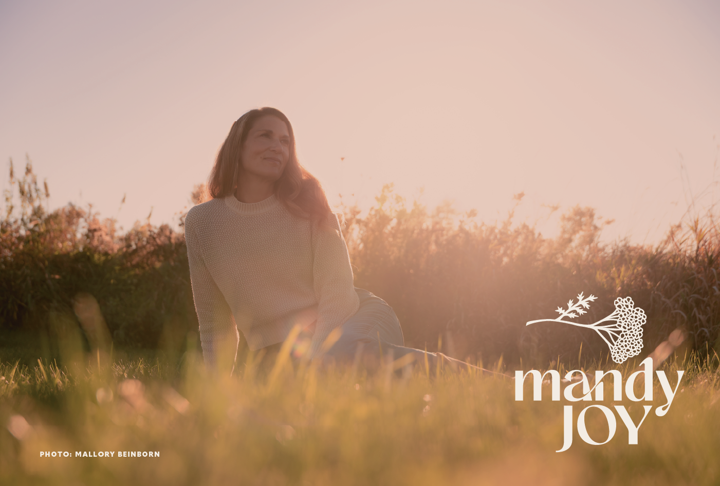
Mandy Joy Wellness
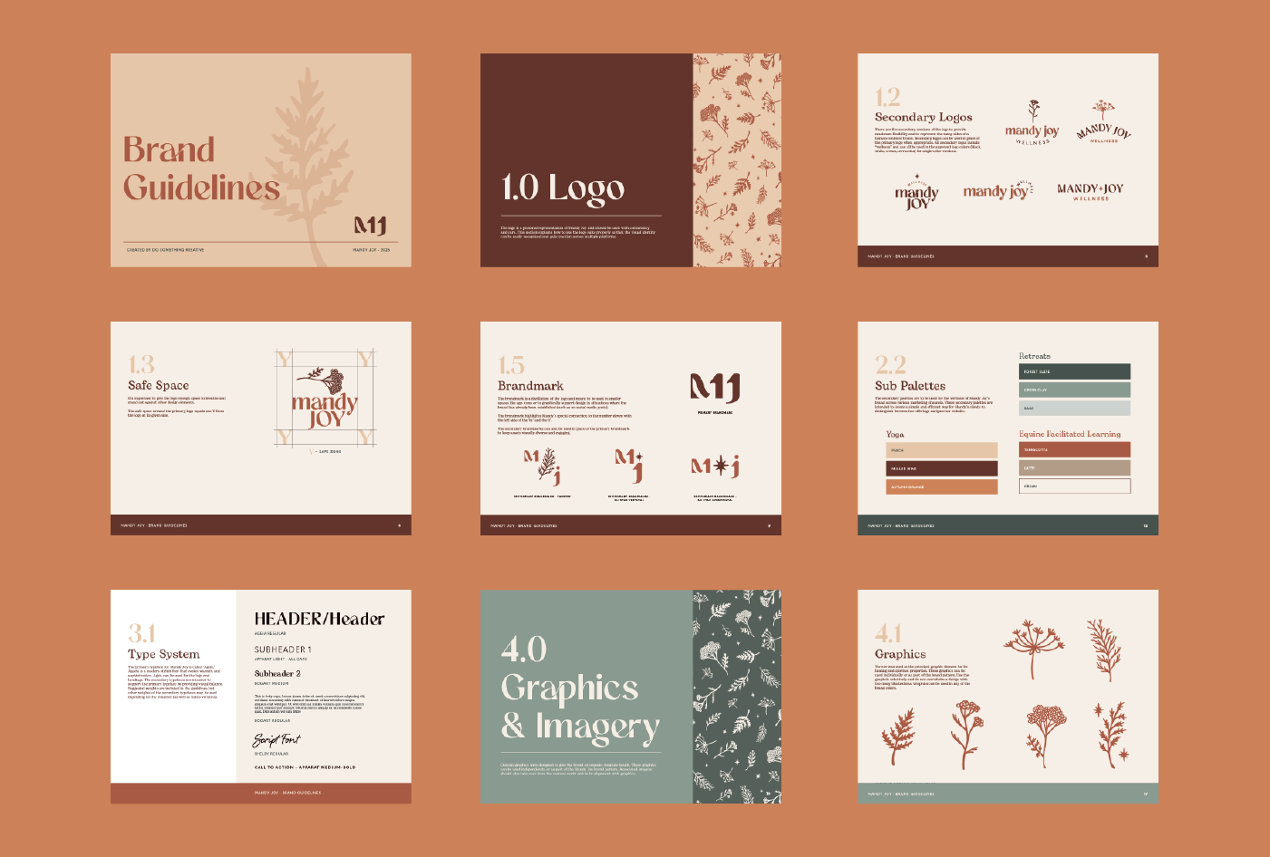
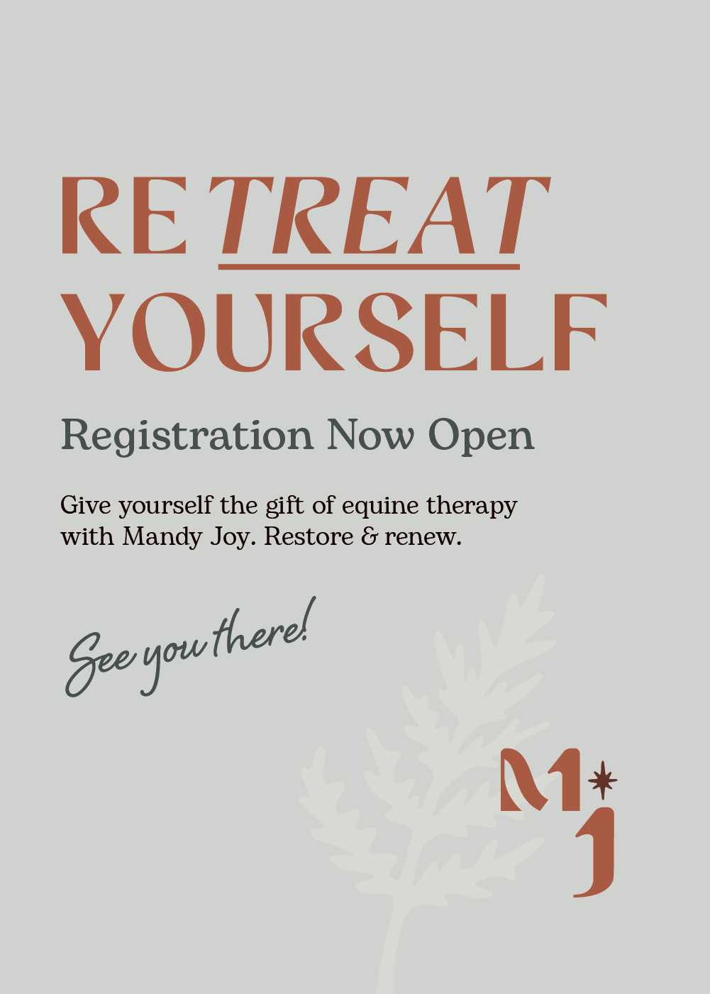
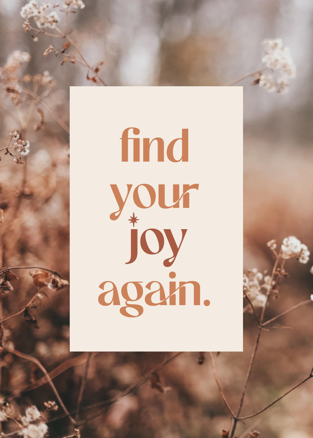
Mandy Joy wanted to launch a personal brand that celebrated her strong, feminine spirit and her mission to help people find their joy again. She also wanted her brand to be flexible enough to represent her unique offerings of yoga, women’s retreats, and equine facilitated learning.
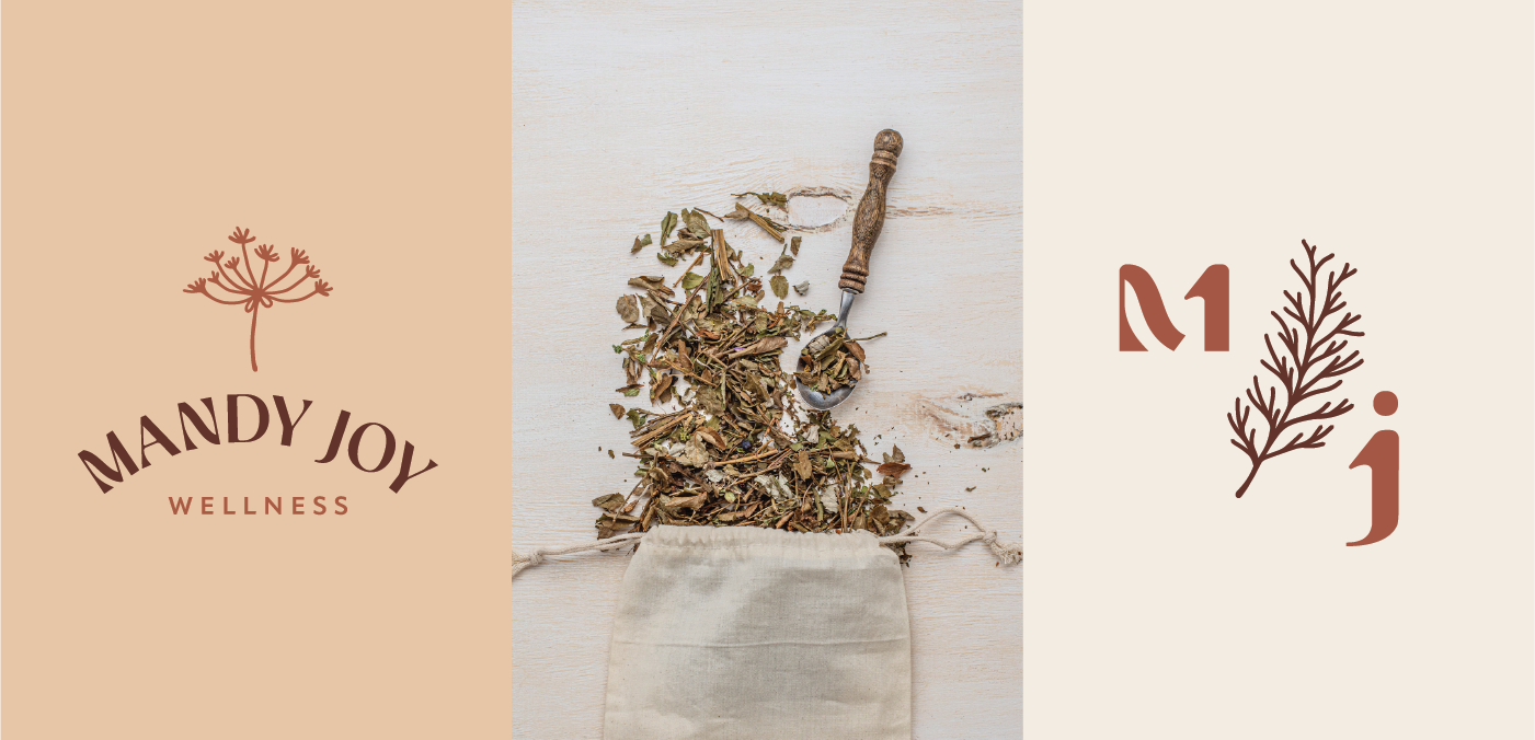
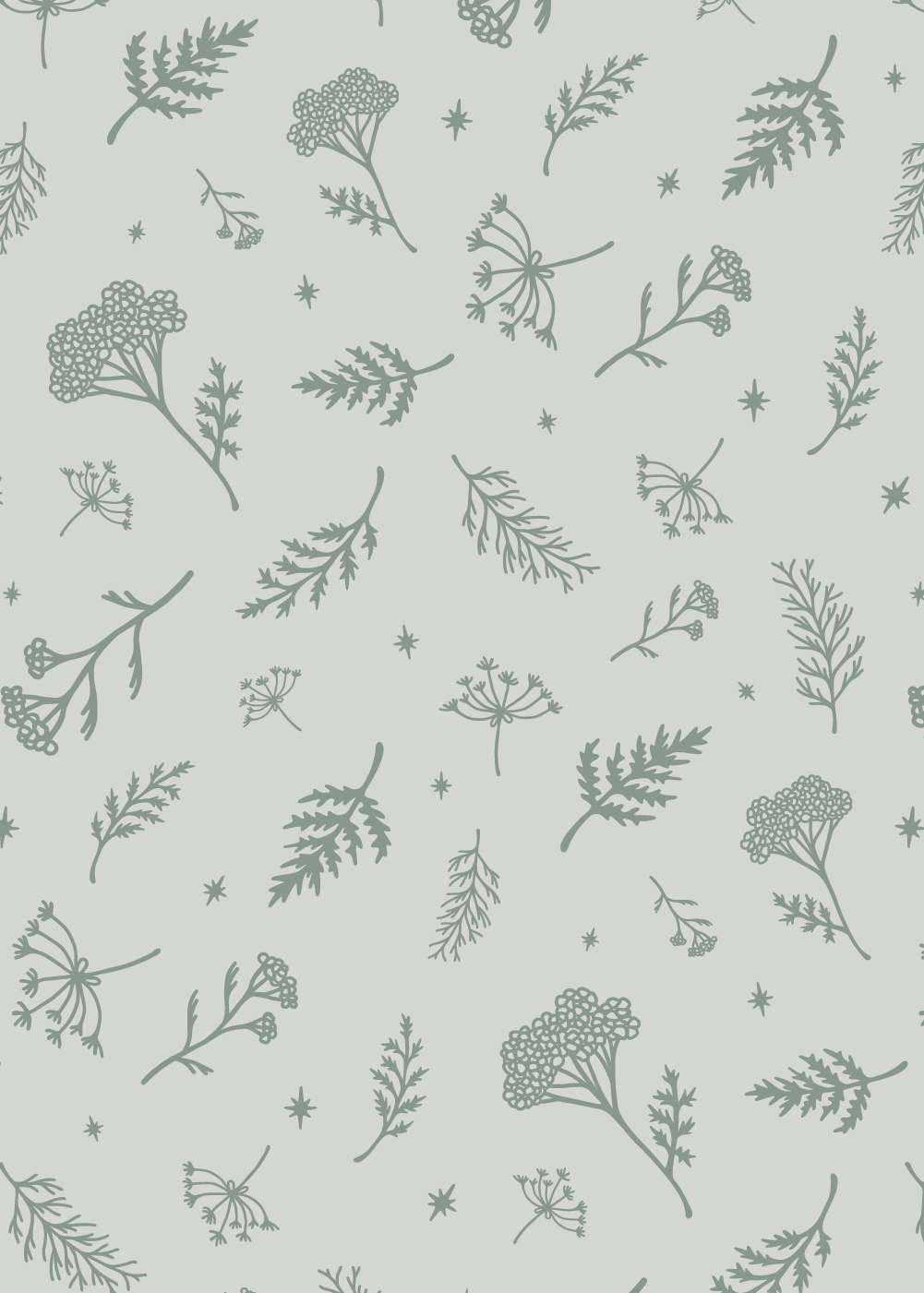
Yarrow was chosen as the primary graphical element for its symbolization of healing, resilience, and feminine strength. The logotype is approachable and Bohemian, feeling at home in the yoga studio or at the barn.
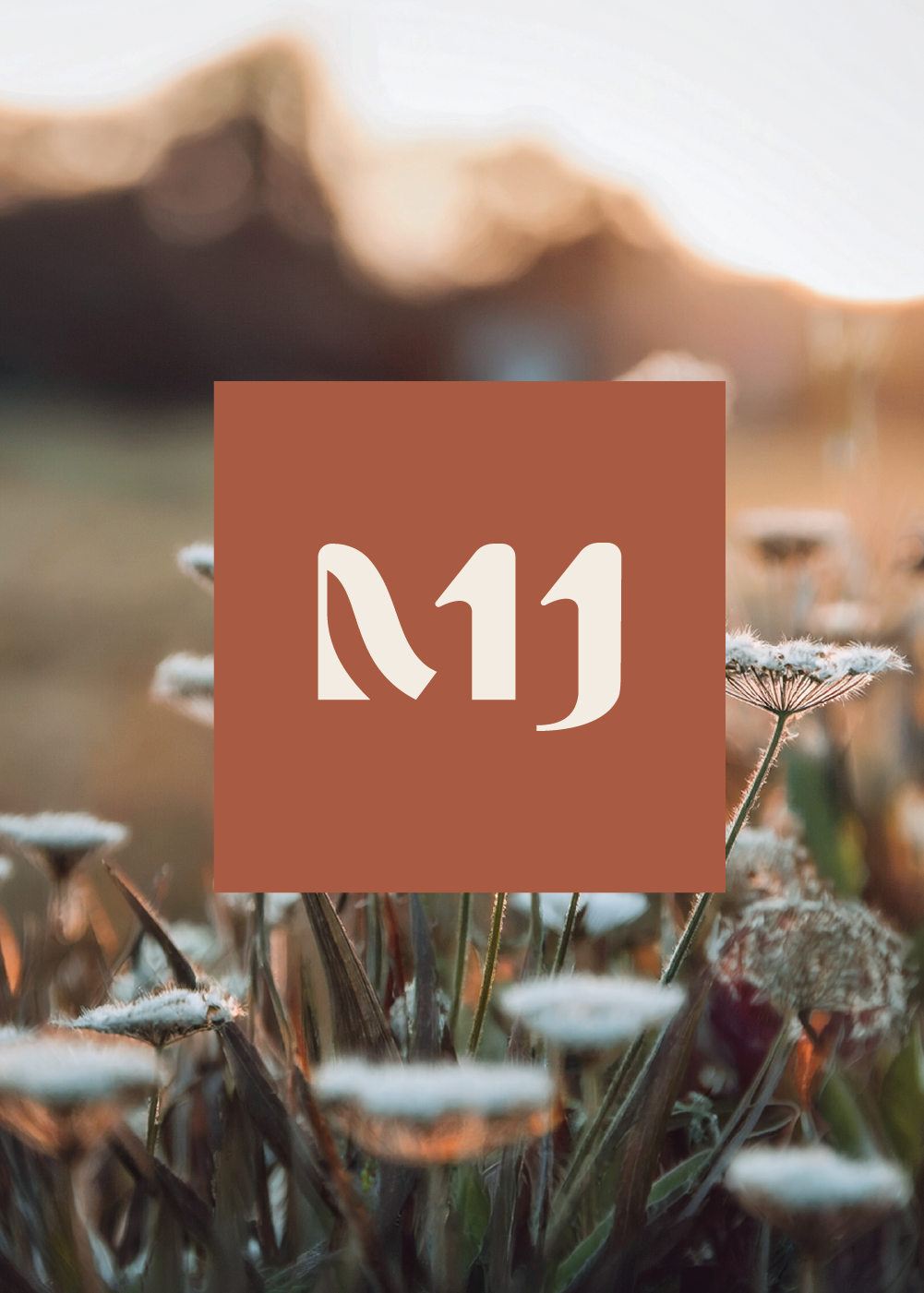
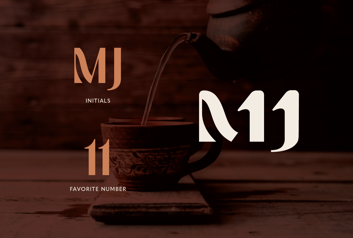
Mandy has a spiritual connection with the number 11, so the logo and brandmark subtly incorporate her favorite number and also nod to the branding on her horses.
ServicesBranding | Copywriting | Illustration | Design
WebsiteWebsite by Local Flow Marketing